Kariyalil Farm House
Kariyalil means kaari - a native fish and chalil - refers small canals seen in paddy fields.
Kariyalil is what our Home is popularly known and called. As our house is situated near vast lands of paddyfields in Parippu.
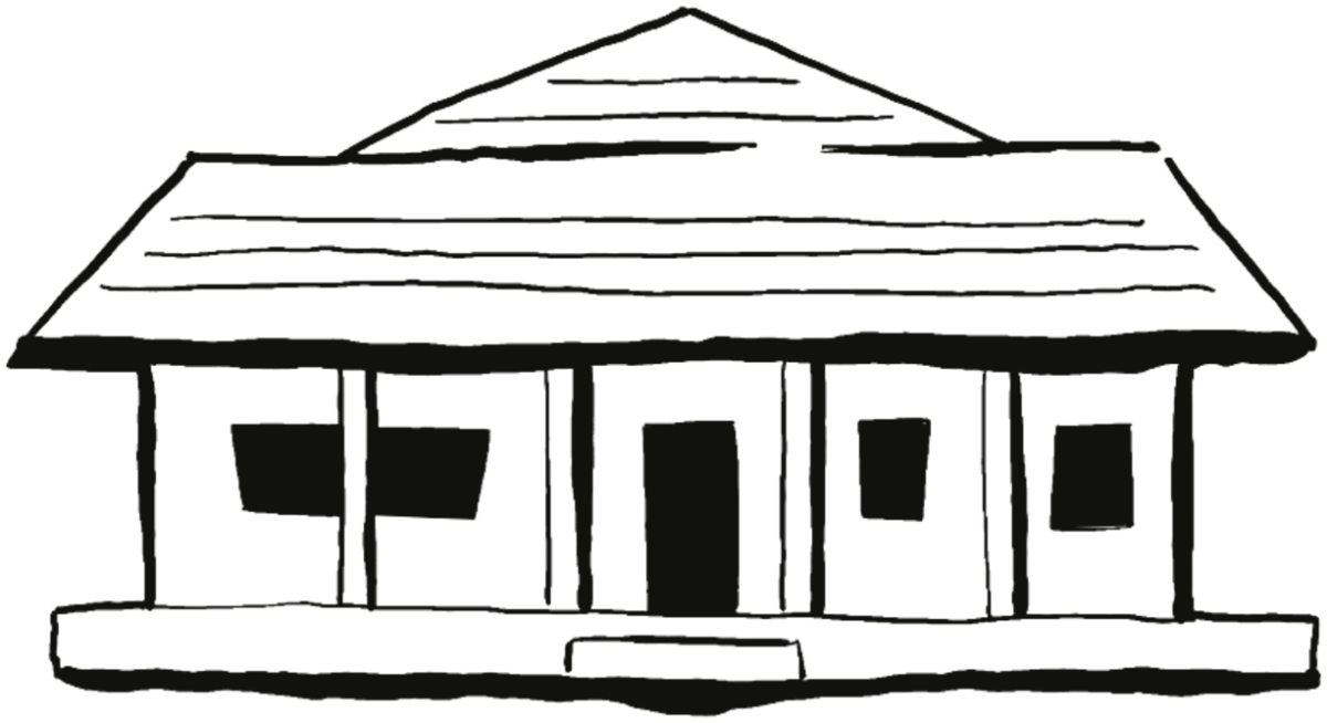
We put the house logo beacause it is where most of the work is done, and all the fruits are sourced from our backyard .
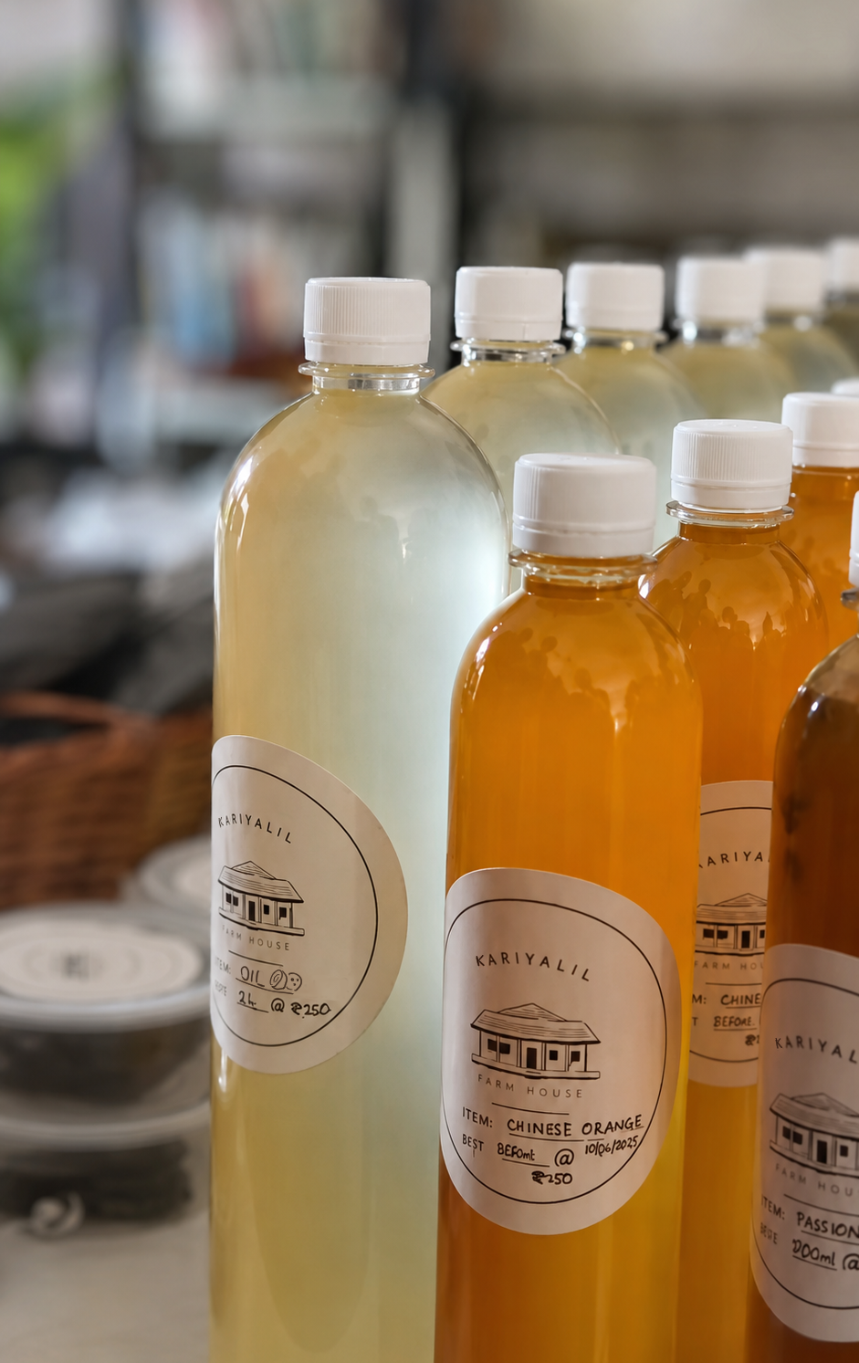
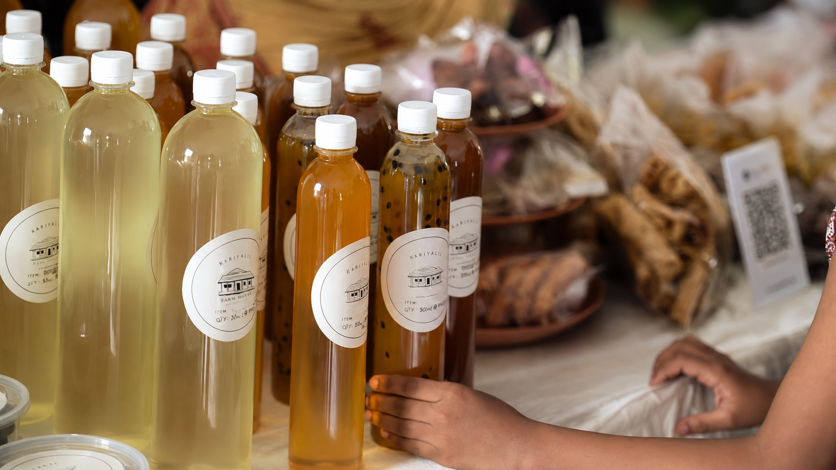
A one-colour label and seal system for the food made at home in Kottayam. The range changes with the season, so one blank — item and weight filled in by hand — covers every jar and pouch, in a single print run.
Made at home
Type direction
The client started with a hand-drawn wordmark. It had character but broke down at 51 mm and could not carry the second and third lines the label needed. After looking at Malayalam-influenced faces I paired Josefin Sans Light for the arced name with Petrona for everything filled in by hand.
Colour
Three pastels were tested against the black mark. The blue read as cosmetic rather than food; the sage sat too close to the leaf tones on the produce. The warm peach keeps the label quiet and lets the fruit be the colour.
Built for the press
A 76 × 51 mm label and a 50 mm round seal, stacking the same three pieces so both read as one family. Everything ships as a single A4 sheet, black on one plate.